In terms of style and color palette, an entry sets the tone of a home. Try viewing your entryway from the perspective of a guest. What changes can you make to create a warmer welcome into your space? We've selected a few variations of entryways with a few tips to spark your next art entry makeover...
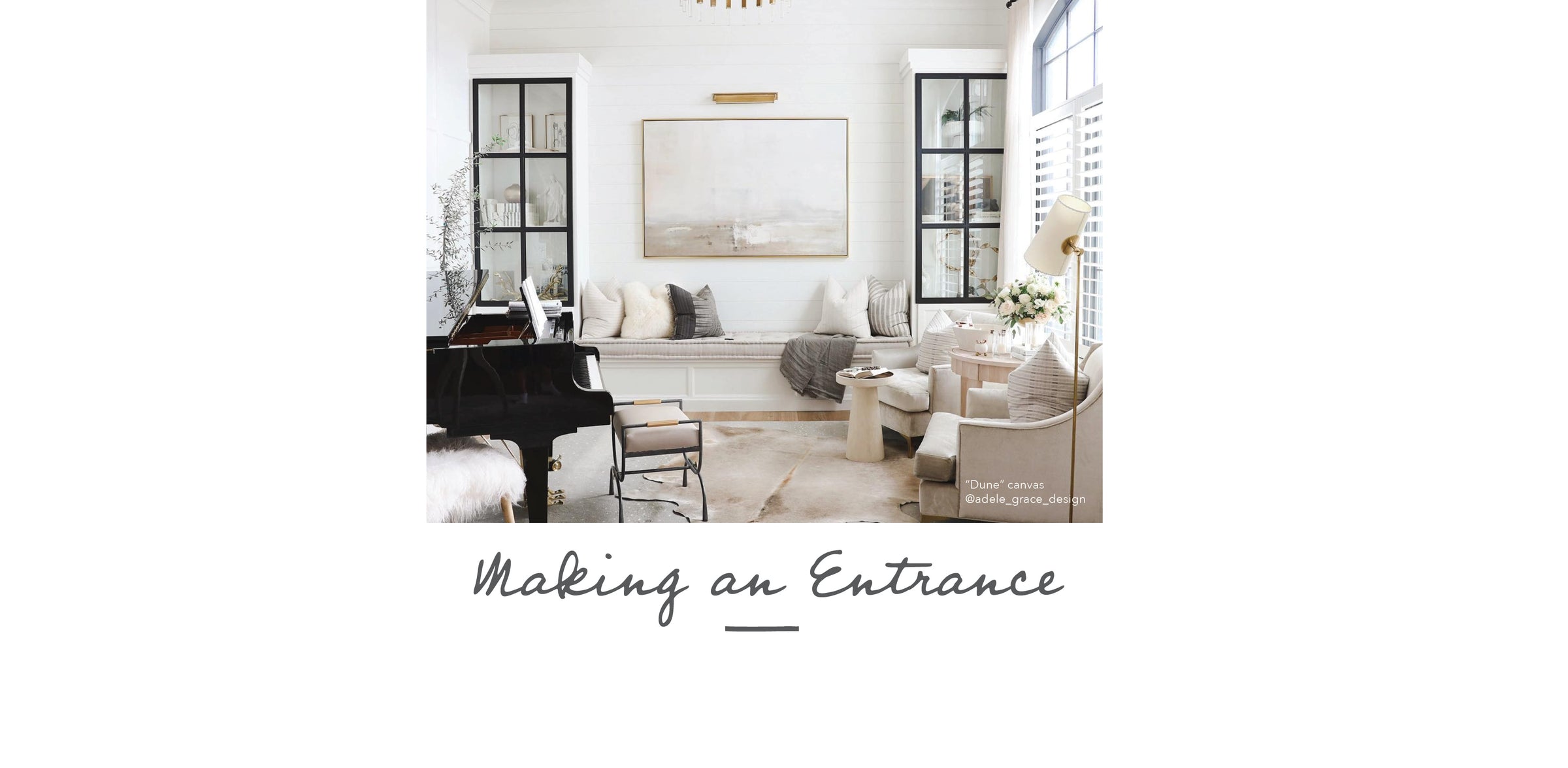
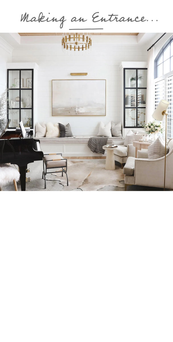

The enduring appeal of soft, neutral tones is undeniable. “Dune” is a great example, pulling in a soothing color palette with the more complex layers of texture.
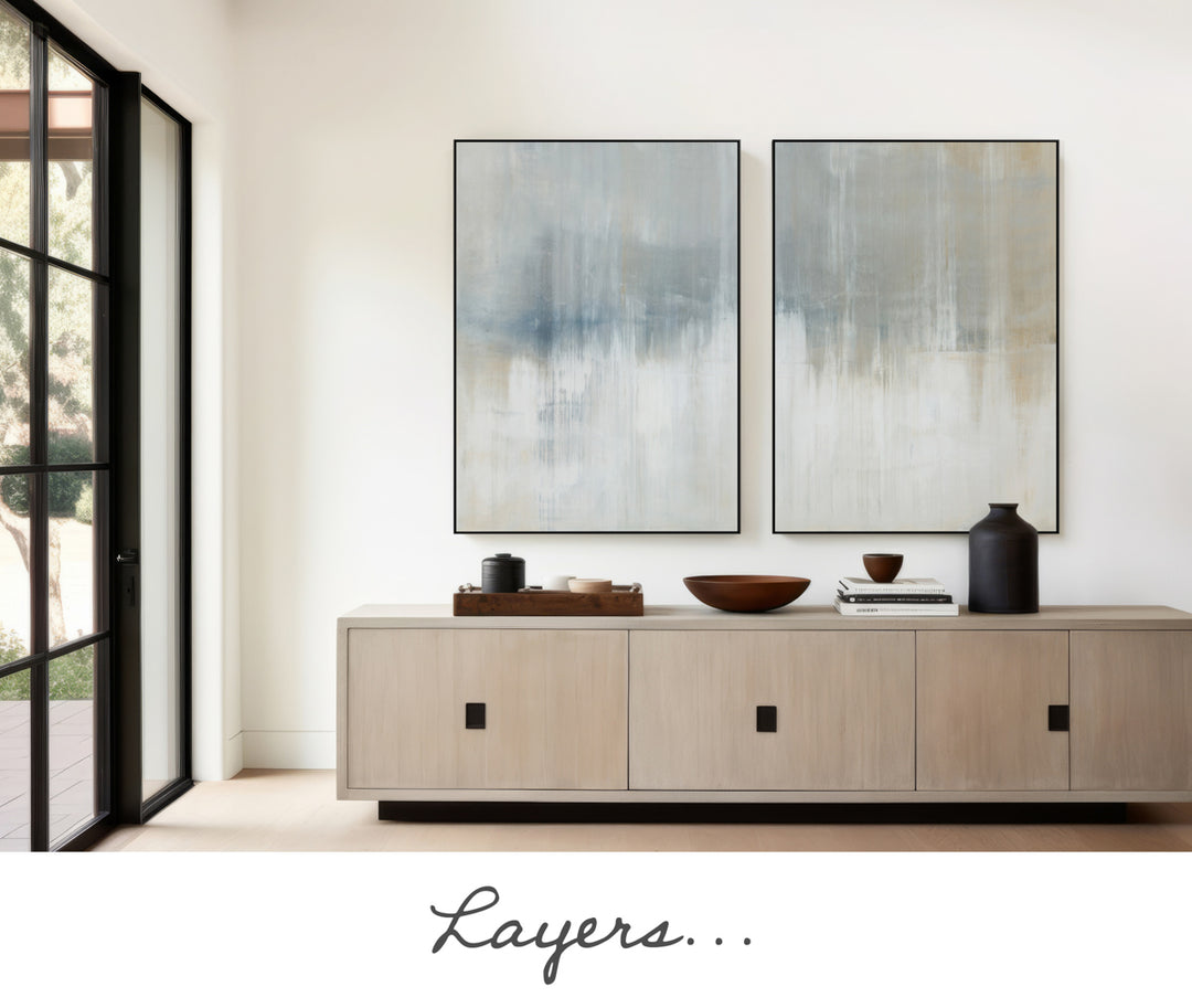
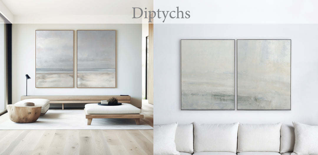
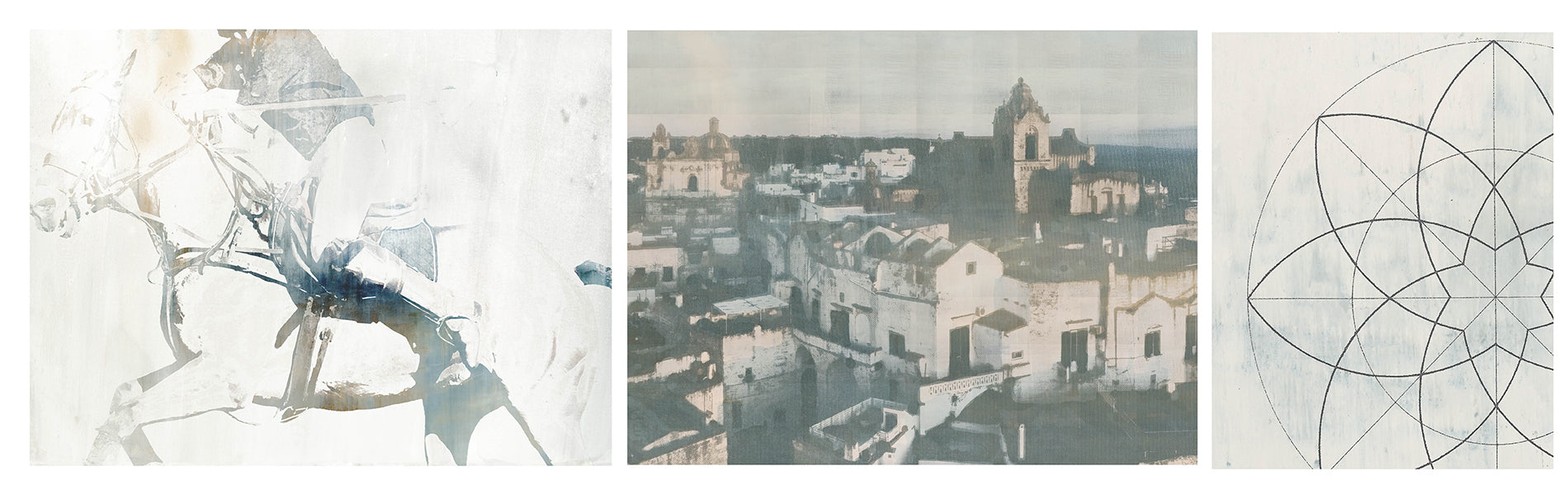
Selecting art with a multi-layered palette as seen here with “Origins #2” sets the tone for the home, hinting at the mood and colors for the rest of the house, the best way to make a great first impression. Each panel of this diptych measures 30” x 40” and takes up slightly more wall space than a 60” wide canvas with a space between the two canvases. Diptychs offer the viewer a different perspective, breaking up a large wall. “Origins #1”, a canvas washed in partially revealed textural layers of neutral colors that reflect subtlety and warmth.

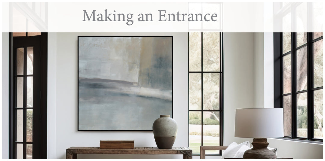
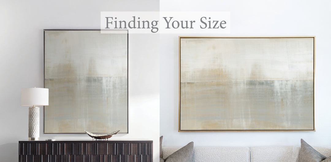
If you have one large wall in an entry and only a few seconds to make a great first impression, consider an oversized canvas. Subtle, but powerful, "Innuendo No.3" has warm neutral tones, beautifully balanced with layers of creamy whites, pale yellows, and smoky grays.

"Land's End" in our 36x36" archival matted print gives the eye room to rest in this cozy entry. The additional white space of a matted print is perfect for smaller spaces. All artwork is available in our 36x36" matted print, each print is initialed by Carol Benson-Cobb.
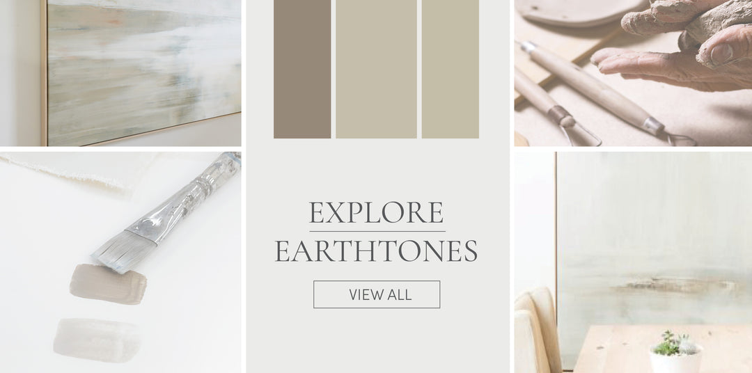
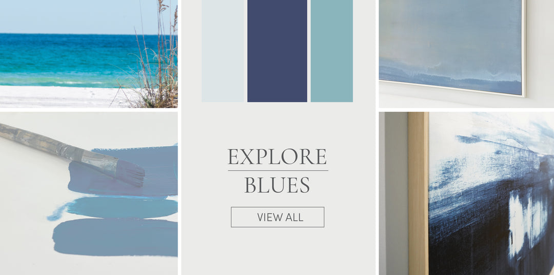
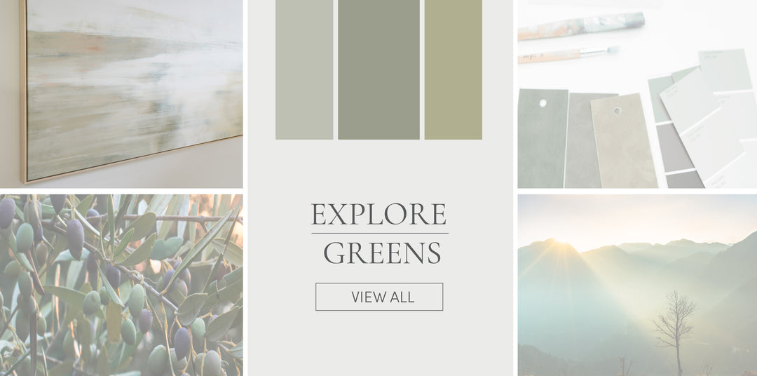
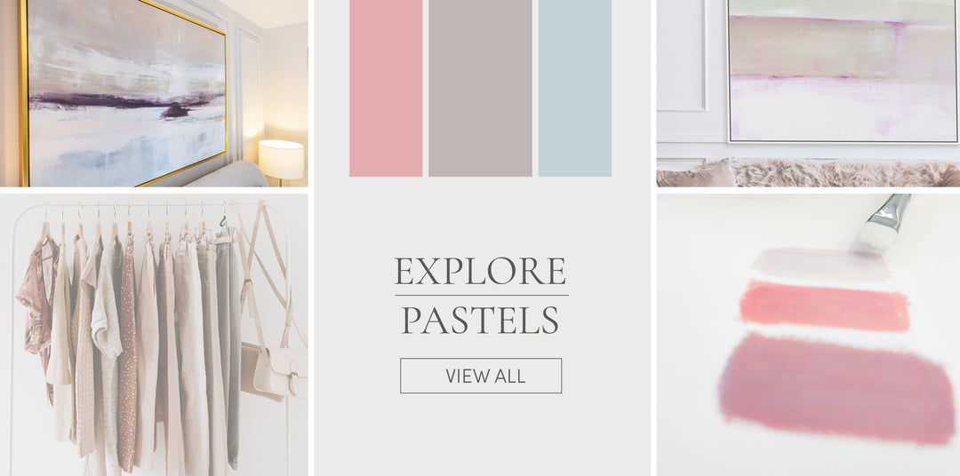
Shop by Color Palette
More Tips
View all