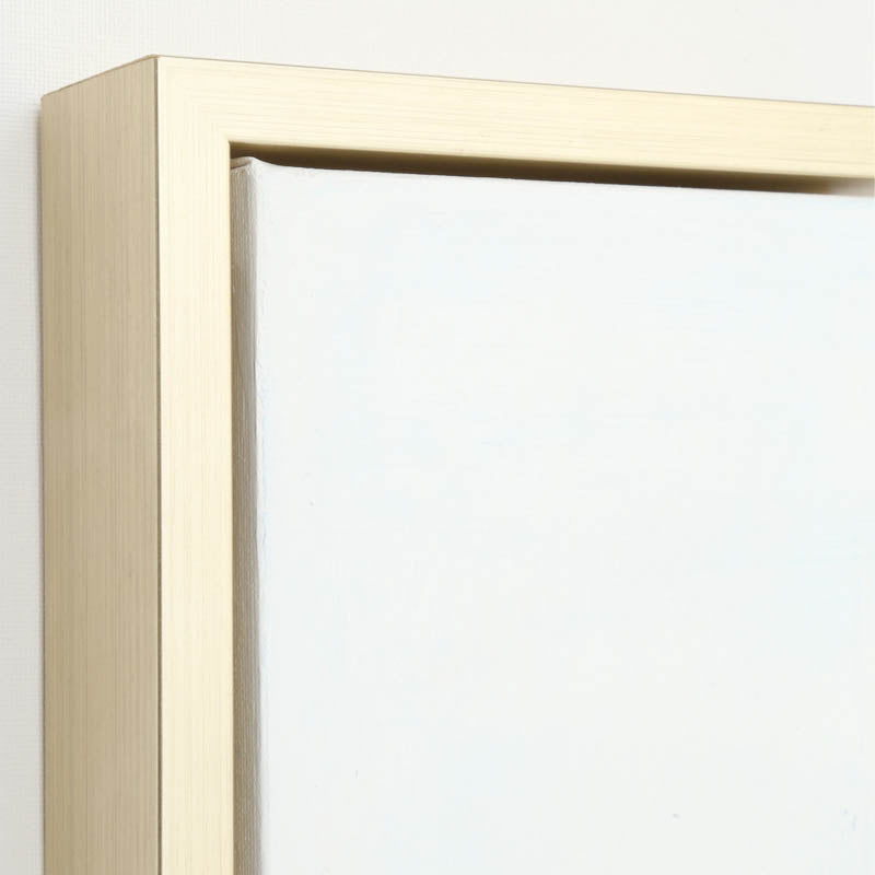
Champagne Gold
Adds 1.5" to overall canvas dimensions
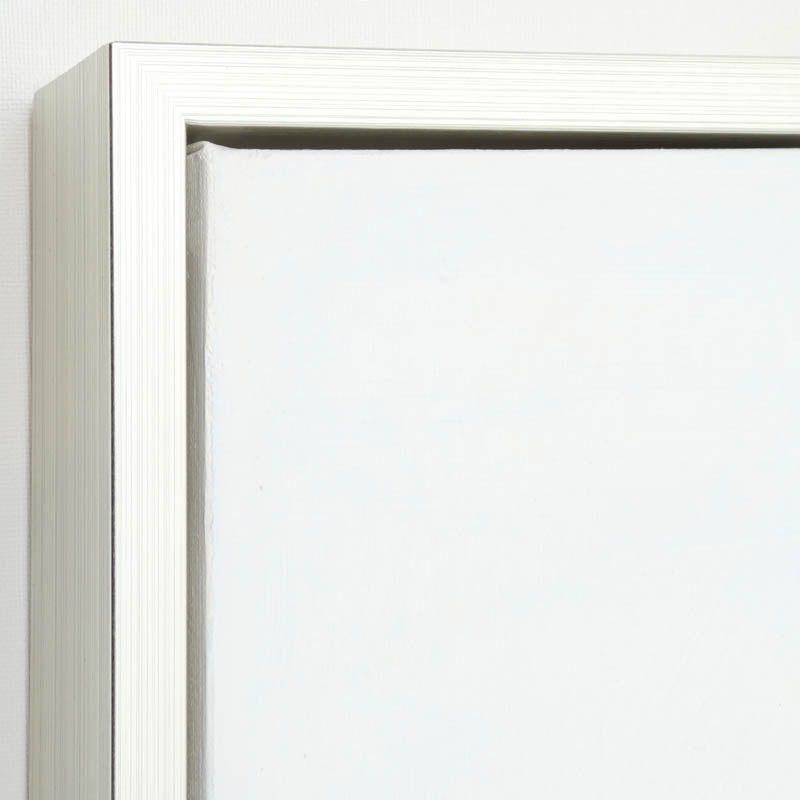
Sterling
Adds 1.5" to overall canvas dimensions

Natural
Adds 1" to overall canvas dimensions
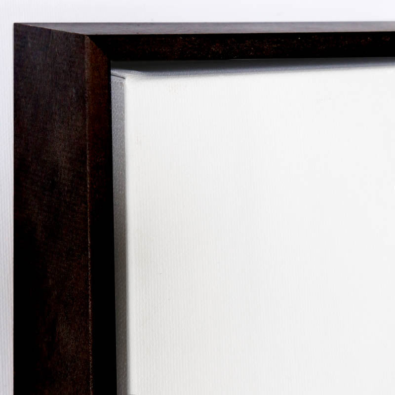
Ebony
Adds 1" to overall canvas dimensions
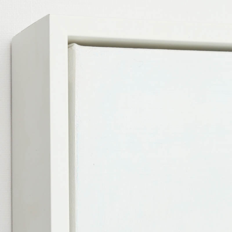
Newport White
Adds 1.5" to overall canvas dimensions
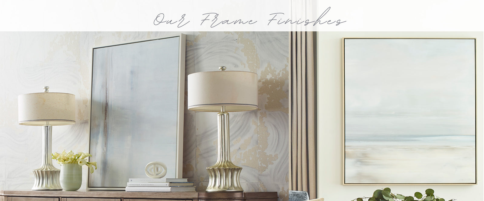
Frame TiPs
The choice of frame for your artwork is just like the art, it is truly personal. We are happy to share some design tips and create digital mock-ups to help you navigate the decision, but in the end it is a personal preference and your desired aesthetic that overrides all external opinions!
A few tips that may help...
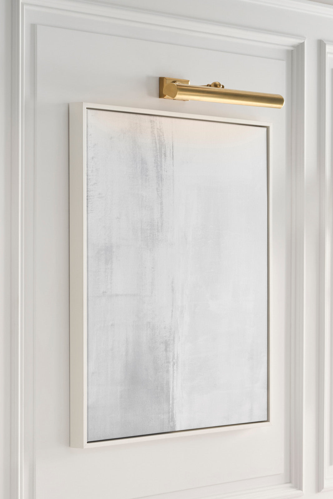
Take into consideration not only the colors within the canvas, but the room and wall color in which the art will be hung.
Think about whether you want the frame to contrast or blend into the background. Consider how the frame will interact with the colors and finishes of the furniture, upholstery, as well as the flooring and window treatments.

Matching vs. Complementing...
In most cases a nice mix of furniture finishes, hardware, and accents is ideal. Matching everything is, in most expert opinions, well...boring.
Need more help? We offer complementary digital mock-ups with your frame of choice.
Which Finish is the Most Popular ?
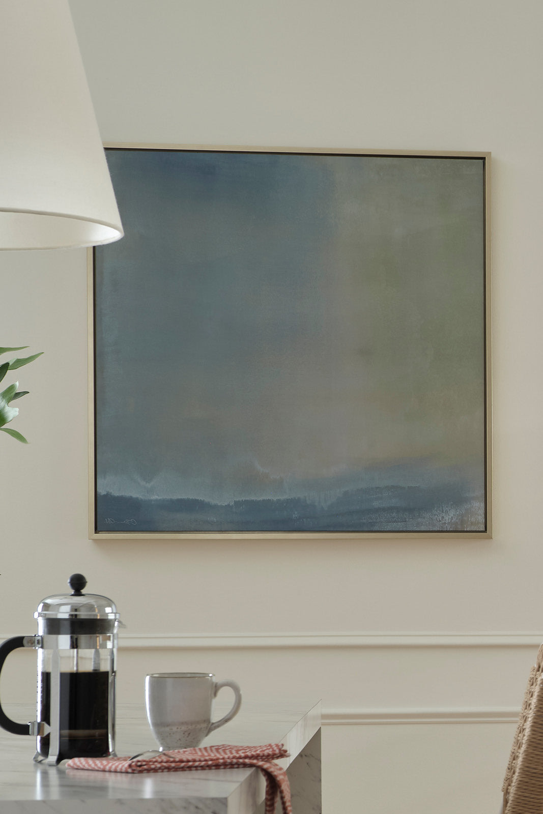
If you are looking to follow the crowd, Champagne Gold continues to be our top-selling frame. The soft gold dresses up the artwork, adding a layer of sophistication to just about any space.