Here are some of my top picks in the cooler tones. Some just speak to me personally, some are timeless top-sellers, a few are brand new releases.


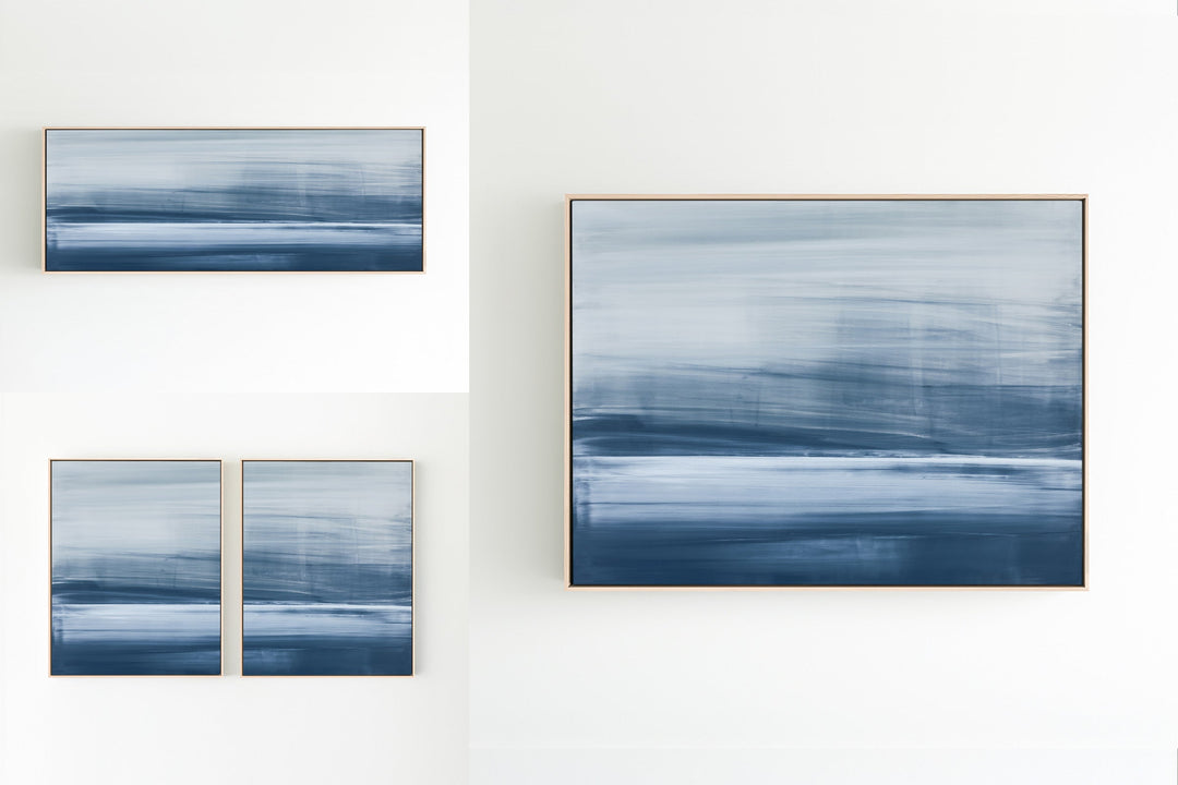
Driven
One of my first paintings to be carried nationally by Neiman Marcus, Driven is a top-selling work as well as a personal favorite. The painting in both name and mood defines a very emotional time period in my career. Driven is offered in many forms, the bluer version was specifically customized for the Neiman Marcus reproduction.

Absolution
A brand new release, the original painting is acrylic paint on canvas, giving the reproductions a sense of canvas texture. The painting is similar to Enigma, painted with similar tones and mood. Absolution is offered in our larger canvas options as well as our largest diptychs and triptychs. I prefer the large horizontal framed in ebony for more contrast.

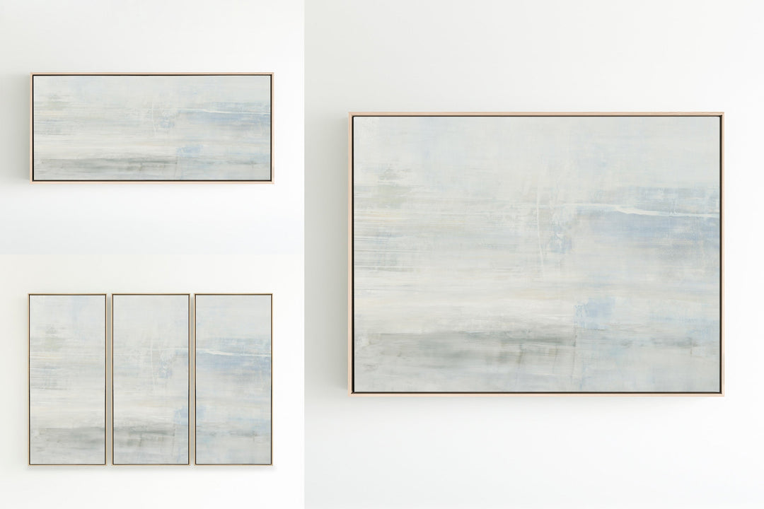
Landscape Study
Painting on board gives the artwork depth that is sometimes harder to achieve with canvas. The original painting is a large board with extensive layering of tone on tone, creating a sense of reflecting light and texture throughout the painting. Landscape Study is one of my personal favorites in the large horizontal canvas, framed in natural.

Filtered
Filtered has a very ethereal mood with flowing layers in minty tones and creamy whites. The painting in a large canvas accentuates the feeling of cloud-like movement, making the artwork impactful if you are looking for a strong focal piece that is still soothing. Ebony framing adds contrast, pulling out the charcoals in the center.

Whisper
A uniquely minimalistic work, Whisper is one of my top picks because it is so subtle and unique. The water-like drops across the painting contrast with the creamy whites and grays layered throughout. I prefer Whisper in a horizontal or square canvas, framed in natural or ebony if you are looking for more contrast.

Landscape No.11
Landscape No.11 is a great companion work to a lot of my paintings. The range of layering is minty to pale blues with an undertone of earthy grays. There is something about the triptych set, each panel is a balanced composition, a singular painting that is able to stand alone.

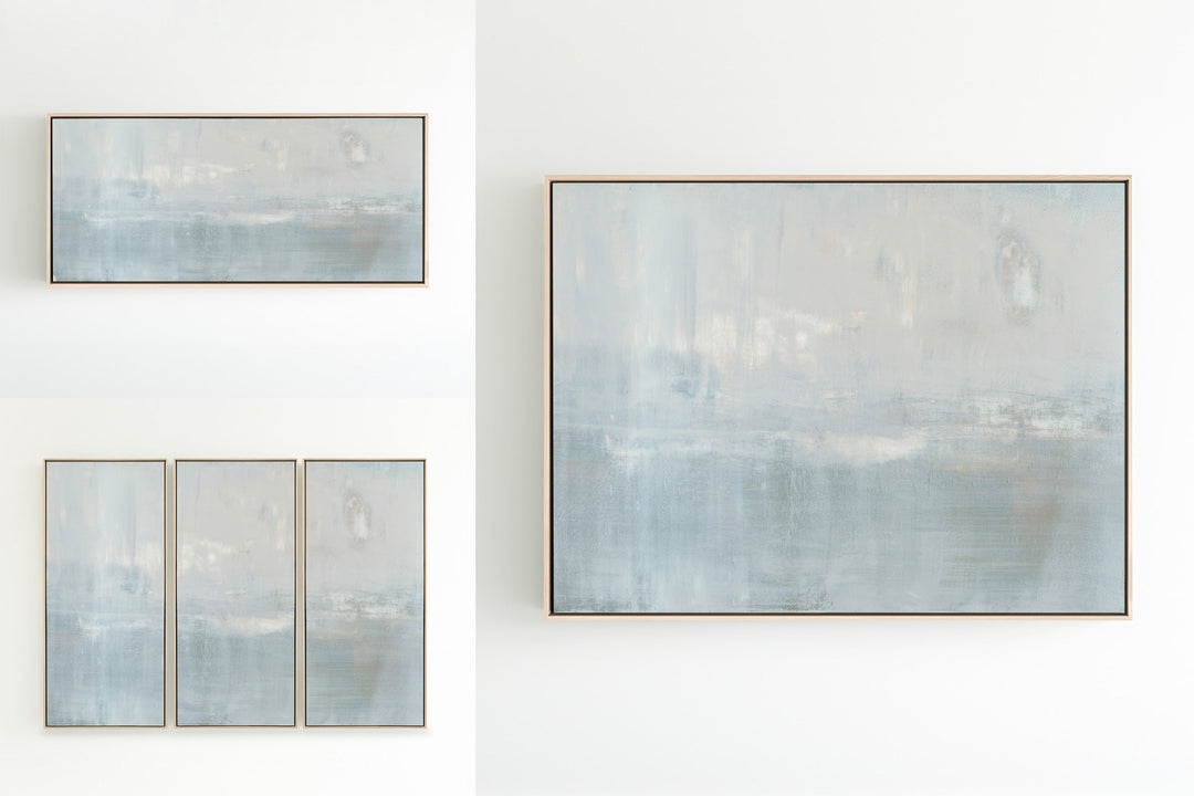
Subtle Persuasion
Subtle Persuasion was painted on board, giving the work depth and drama. I prefer the introduction of color to be more subtle, hence the name. Subtle Persuasion has soft color in corals, blush and blue. I like this piece in the triptych, ebony adds contrast and natural is almost always my favorite frame.

Intuition
Minty blues and greens are layered over creamy whites. Intuition is a top-selling work, available in various options. I am partial to the singular, larger canvas. Ebony framing adds contrast and brings out the deeper tones. Champagne gold always has a way of elevating the canvas.

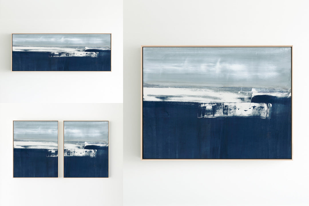
Shallow in Gray
I have always like this painting in the form of a diptych. The panels are connected with the slight extension of color. Shallow in Gray was released as a toned-down version of the original painting, Shallow. I love the natural frame stock, adding to the coastal vibe. Our sterling framing will elevate the canvas.